- Role
- UX/UI Designer, team of three
- Scope
- Platform design for Mexico, Brazil and Latin America: category architecture, onboarding, search, recipe pages, planner and UI kit
- The problem
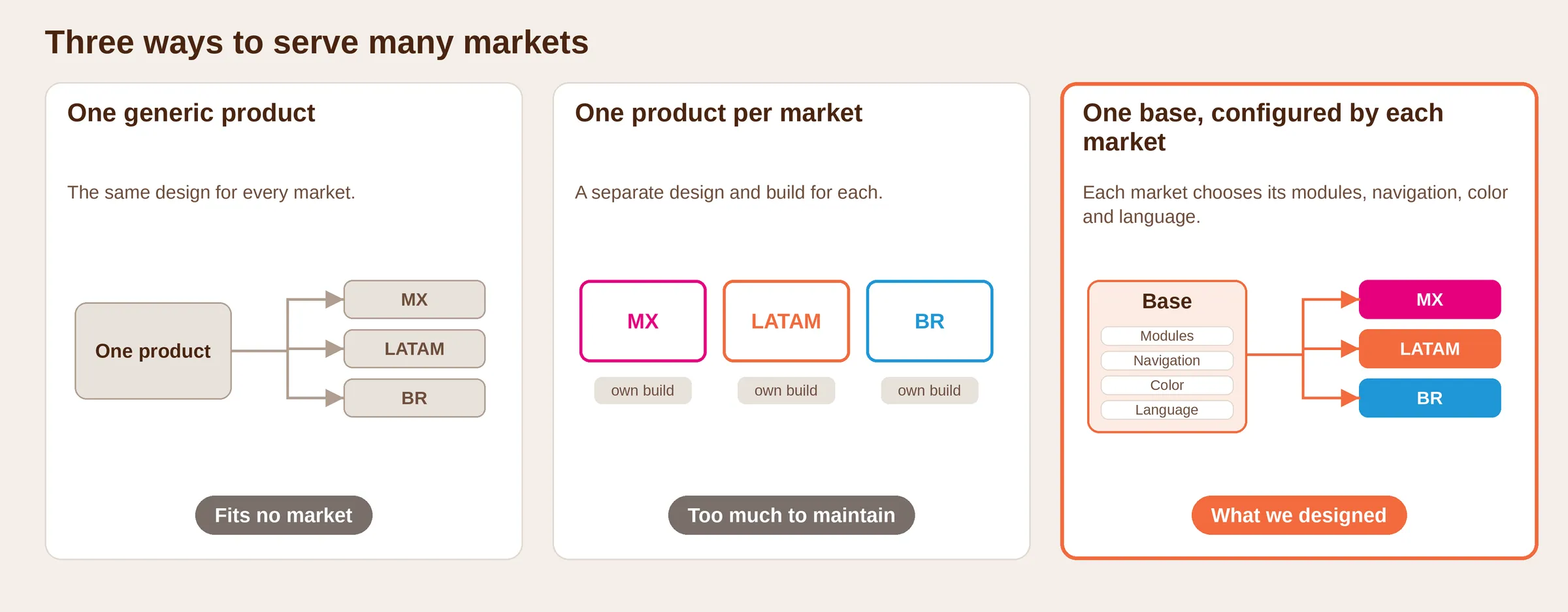
- Nestlé needed one recipe platform for many Latin American markets. One generic product would fit no market, and one product per market could not be maintained.
- My role
- UX/UI designer on a team of three under our design lead. We won the platform in a competitive pitch in December 2020. I presented to Nestlé’s stakeholders and proposed the site structure, the recipe page and the brand entry point.
- What I decided
- One complete base, where each market chooses its modules, navigation, color and language. Ten category families with one image library.
- Where it stands
- Live in Mexico, Brazil, Central America, the Caribbean and South America. Everything we designed was implemented, except the cart.
4
regions
Mexico, Central America, Latin America, Brazil
3
languages
Spanish, Portuguese, English
15+
countries across Latin America and the Caribbean
200+
screens designed by our three-person team
Desktop and mobile, three market files
Context and my role
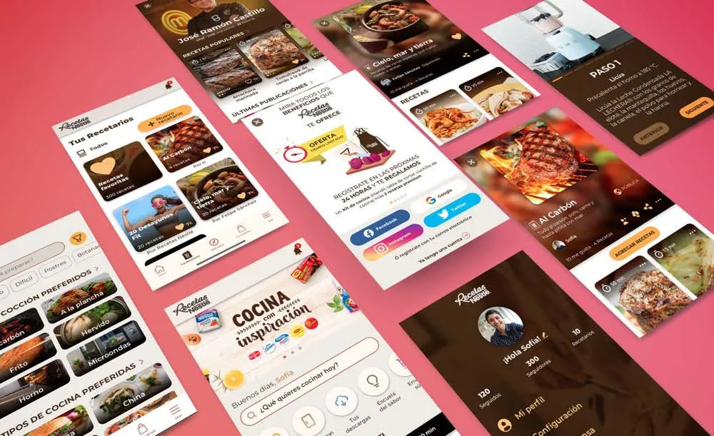
Recetas Nestlé is Nestlé’s recipe platform: recipes built around its products, recipe books, a meal planner, search by ingredient and cooking classes. Our team at AgileThought (now Motivus) designed the platform that runs today, foundations included. F5 built it.
Nestlé wanted people to come for recipes and leave with its products in mind, since every recipe uses one. The audience was home cooks in very different markets: Brazil works in Portuguese, the Caribbean in English, and the rest of Latin America needed one product from Central America to the Southern Cone.
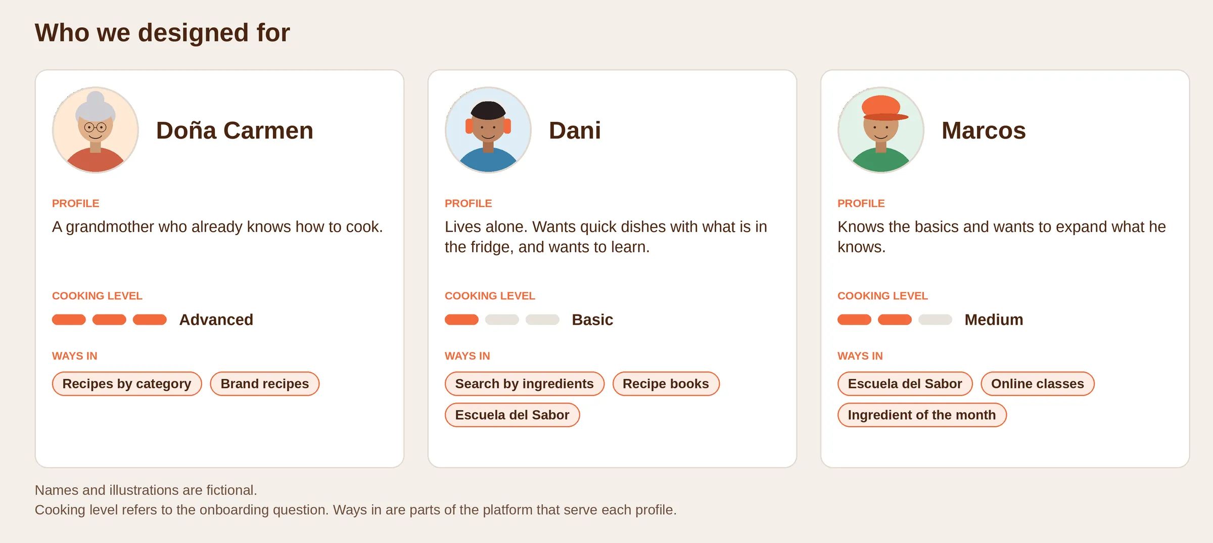
We designed for three profiles: a grandmother who already cooks, young people living alone who want quick dishes and to learn, and people who know the basics and want more. The recipe books and Escuela del Sabor came from the second.
Open full image (opens in a new tab)
The problem
The brief went beyond a recipe catalog: recipe books, weekly recipe recommendations, and a way to bring Nestlé’s products into everyday cooking.
Open full image (opens in a new tab)
How I approached it
Pitch and stakeholders. My lead built the strategy with sales and I designed the prototype. Scope came from Nestlé’s global team in Switzerland, then the brand teams of Mexico, Brazil, the Dominican Republic and Ecuador.
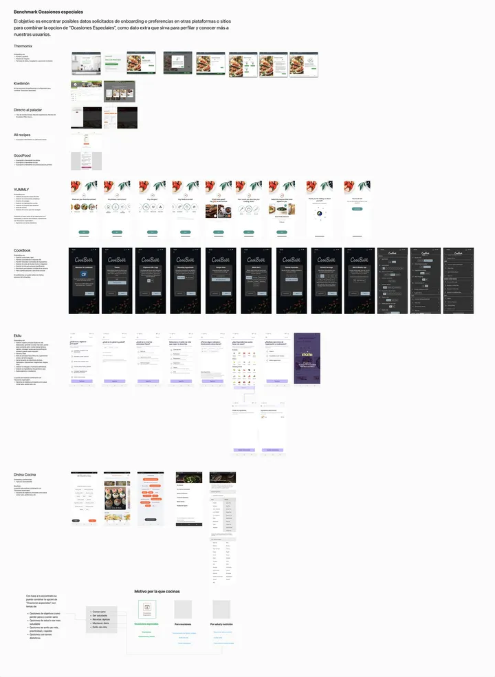
Benchmark. To decide what to ask users, we looked at the onboarding of nine recipe platforms, among them Thermomix, Kiwilimón and Allrecipes.
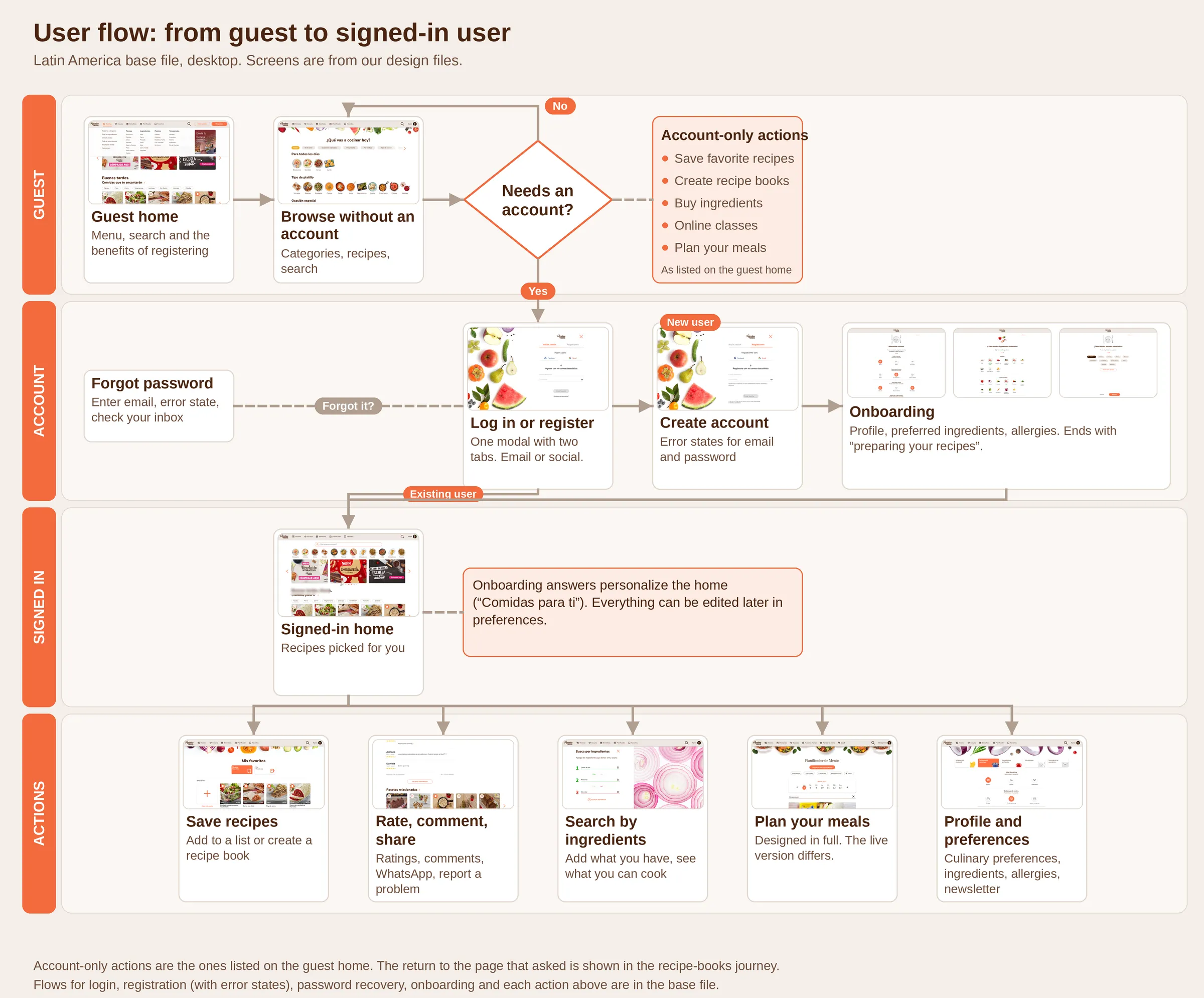
A base file, then market files. We designed the complete platform in a Latin America base file, then adapted it for Mexico and Brazil.
Open full image (opens in a new tab)
Key decisions
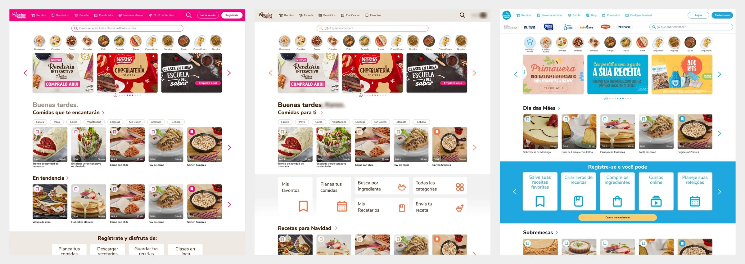
One base, and each market chooses
- Decided
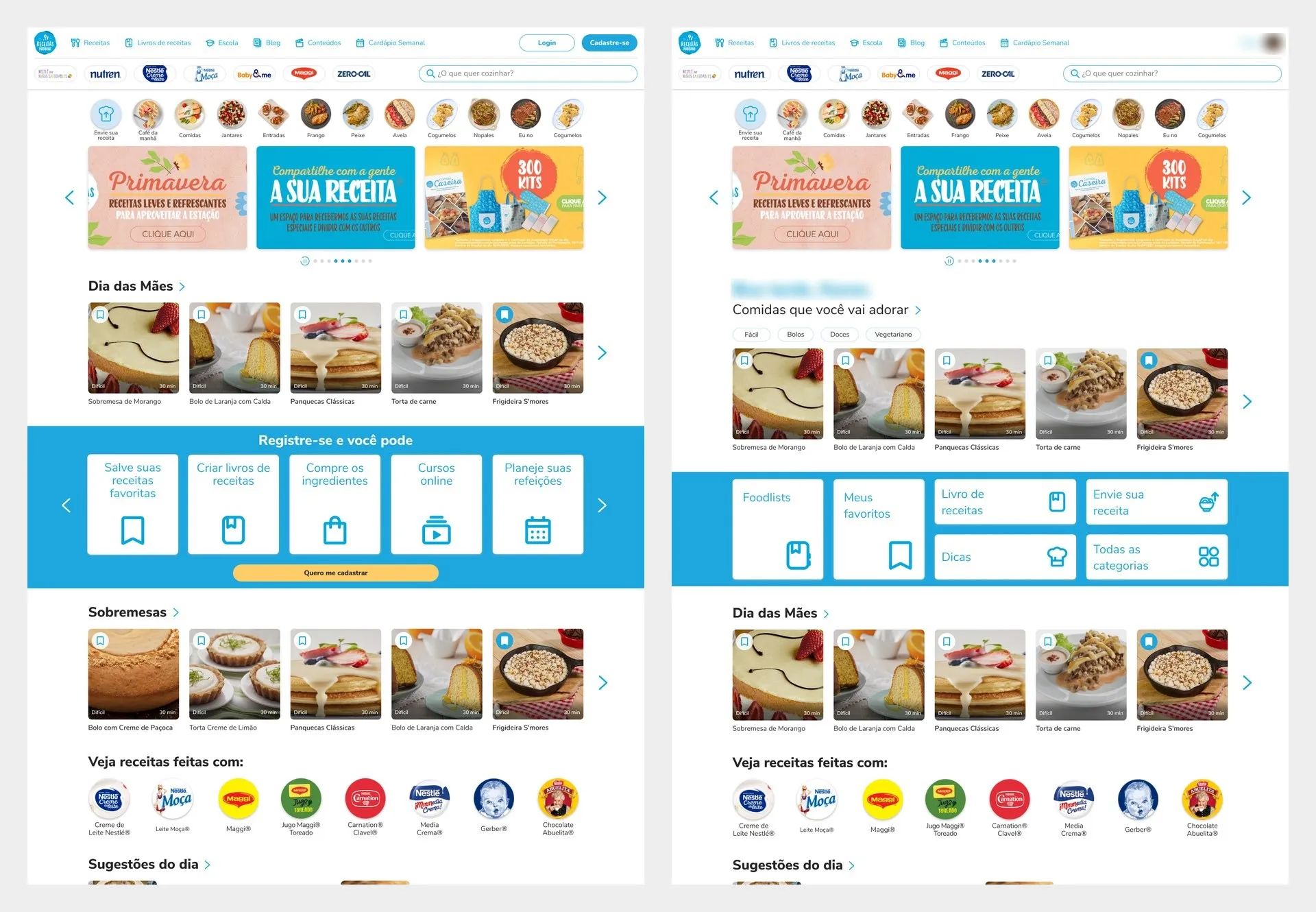
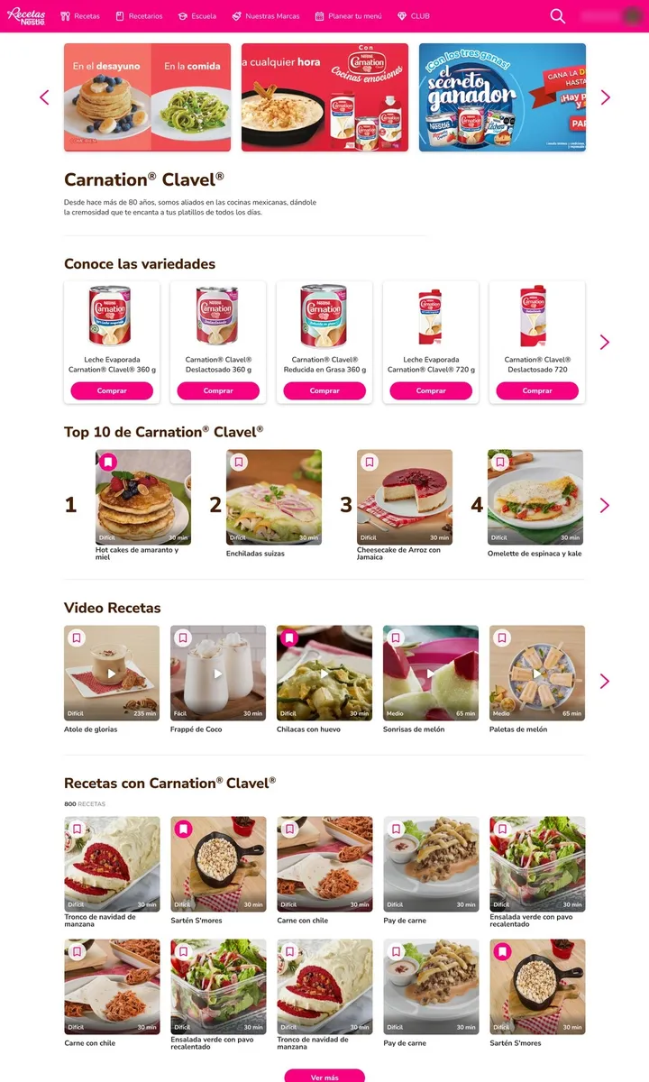
- A complete Latin America base with every flow and module. Each market chose its modules and navigation and got its own color: Mexican pink for Mexico, orange for Latin America and Central America, sky blue and Portuguese for Brazil, which also got its own header and a bar of brand logos.
- Discarded
- Three products designed from scratch.
- Why
- One generic product would fit no market, and one product per market could not be maintained.
Open full image (opens in a new tab)
Ten category families, one image library
- Decided
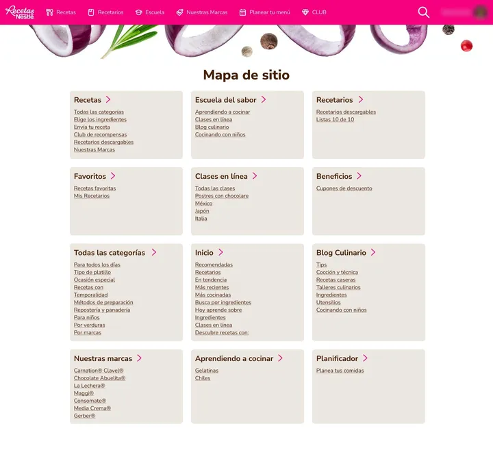
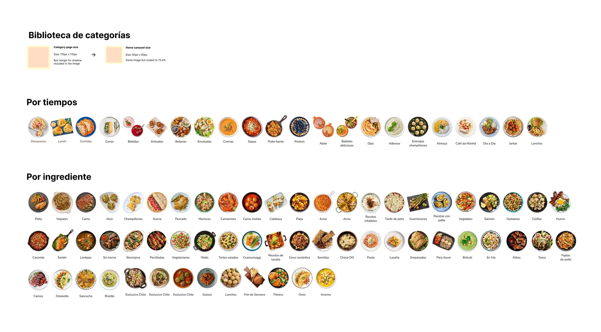
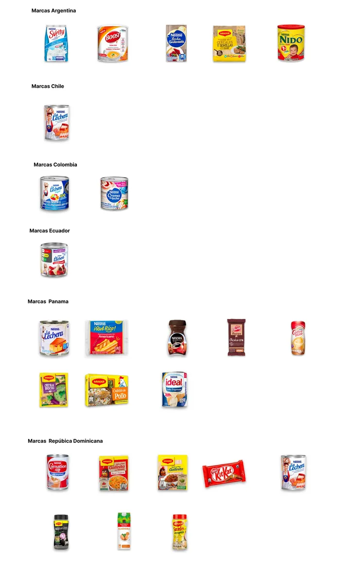
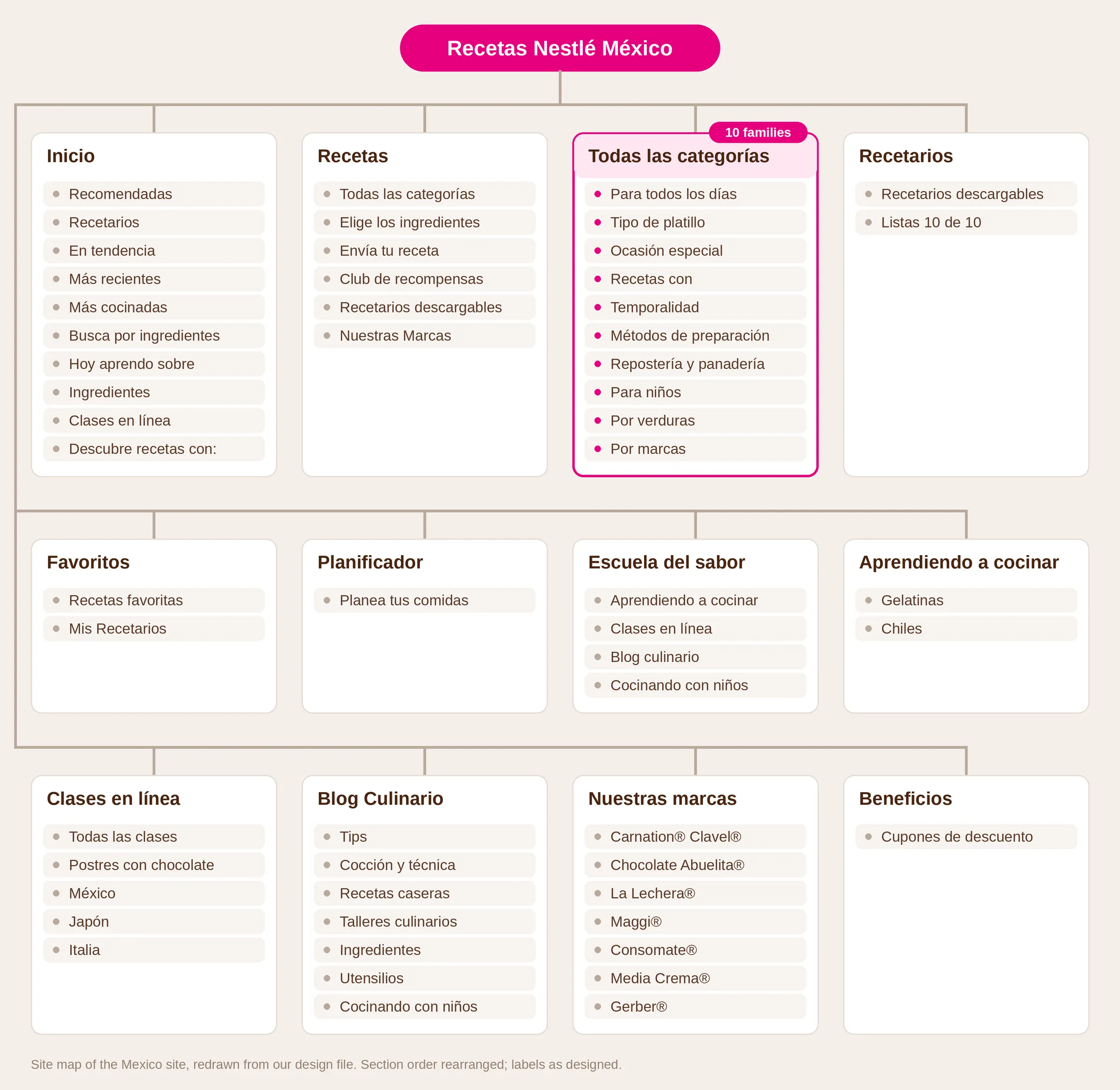
- On Mexico’s site map, “All categories” groups recipes into ten families: everyday, dish type, special occasion, by ingredient, season, cooking method, baking, for kids, vegetables and brands. One image library feeds them, with market-only categories and a brand layer per country.
- Discarded
- Picking one way to browse.
- Why
- People look for food in all of those ways.
Open full image (opens in a new tab)
Ask why people cook
- Decided
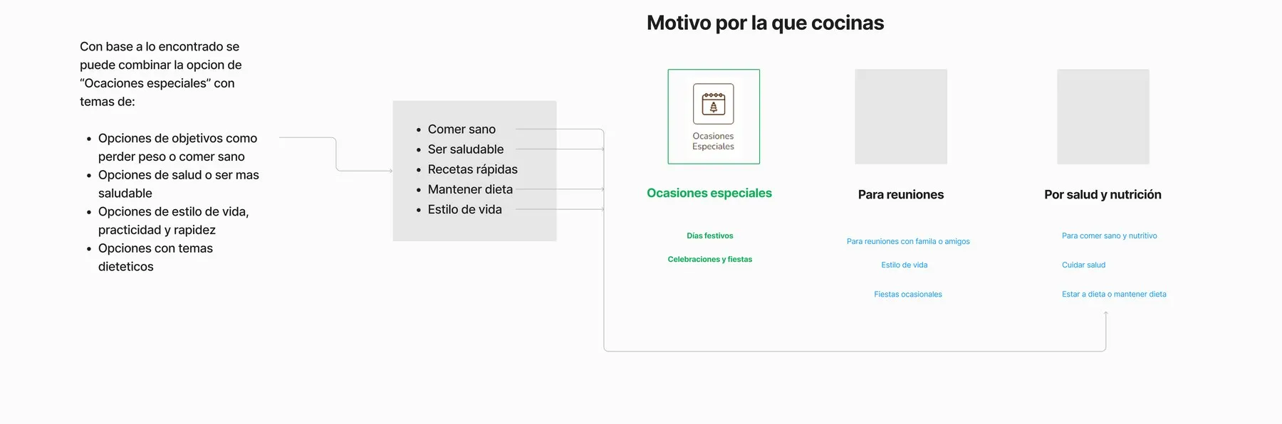
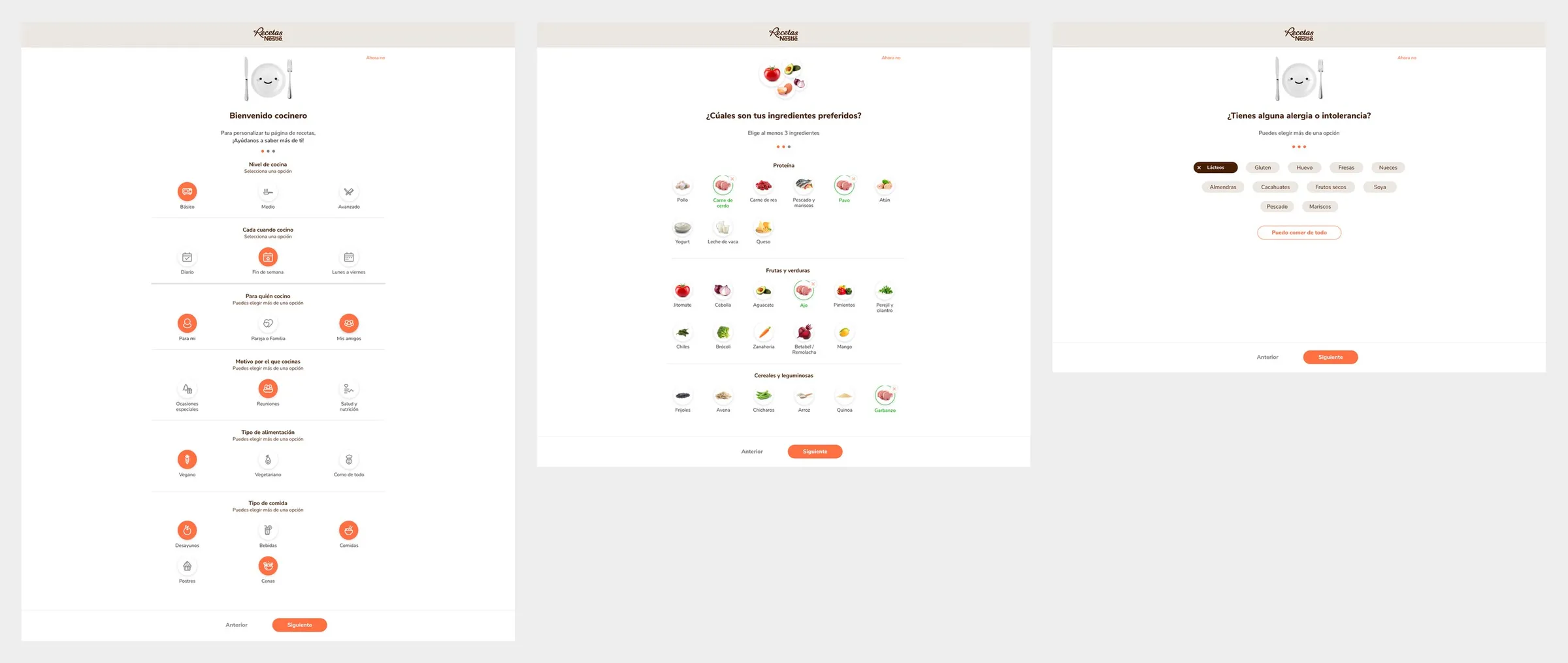
- Onboarding asks why you cook (special occasions, gatherings, or health and nutrition), next to cooking level, diet and meal types, then ingredients and allergies. Everything can be edited later.
- Why
- The benchmark’s conclusion was to combine a “special occasions” option with goals people share on other platforms: eating healthier, quick recipes, keeping a diet. That became one question.
Open full image (opens in a new tab)
Open full image (opens in a new tab)
A planner that asks before it plans
- Decided
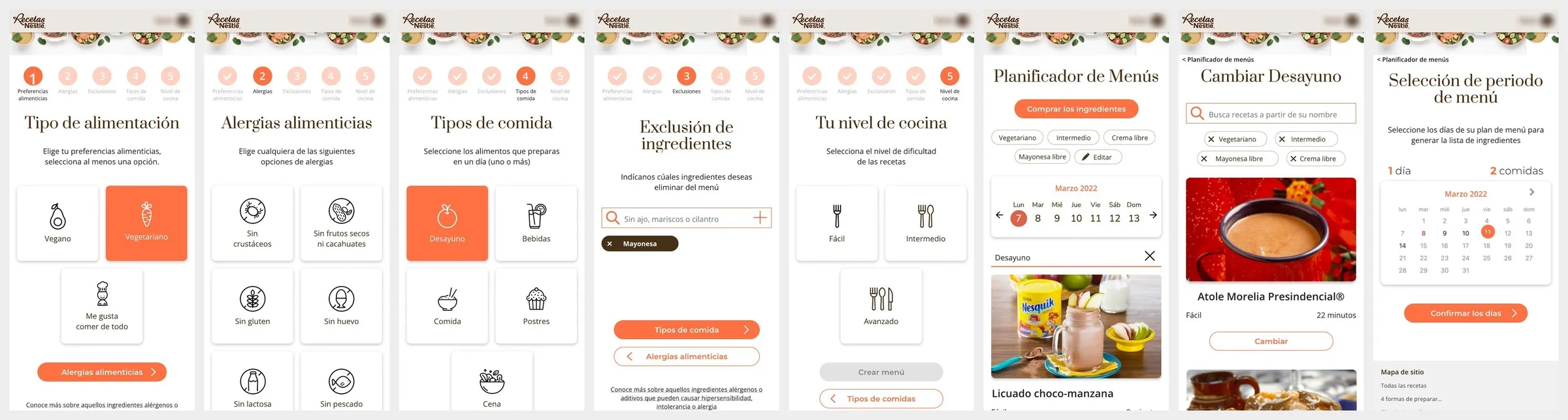
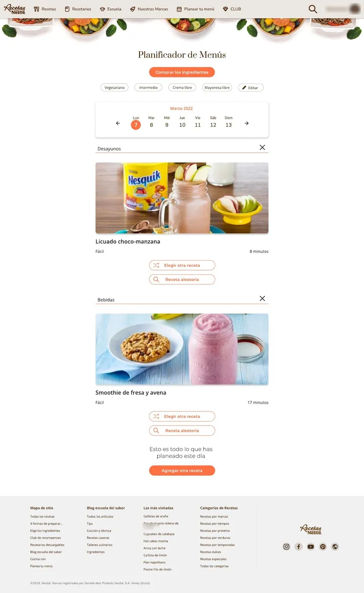
- A short preference flow (diet, allergies, meal types, plan length, exclusions, cooking level), then a week of meals from the catalog, with any meal swappable. We designed it in full for mobile and desktop.
- Why
- Nestlé had asked for weekly recipe recommendations. The planner and the allergy preferences were our team’s ideas, and Nestlé accepted them.
Open full image (opens in a new tab)
The solution
Open full image (opens in a new tab)
- Accounts: login and registration with social sign-in, password recovery, onboarding and preferences.
- Home: guest and signed-in versions, a category carousel and a personalized row.
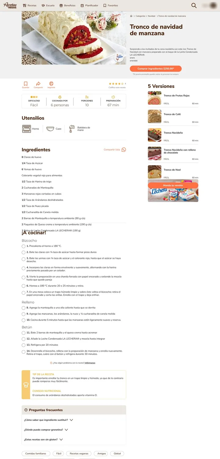
- Recipes: category pages and a recipe page with versions, utensils, a step checklist, ratings and comments.
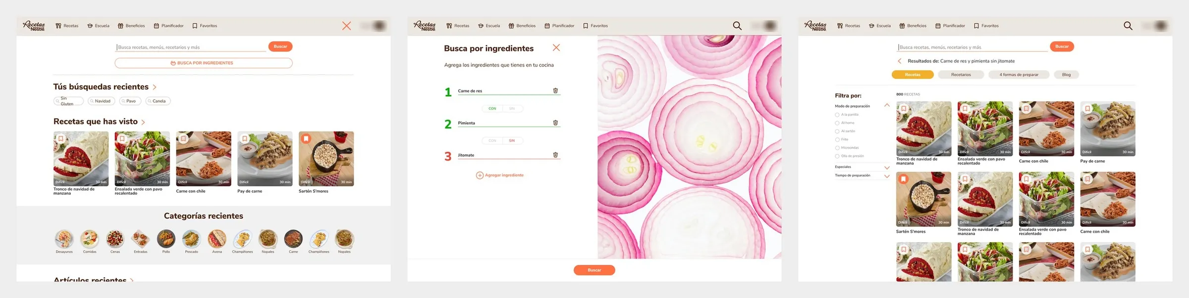
- Search: recipes and blog articles, opening with recent searches, and search by ingredients: add what you have, one at a time, and see what you can cook.
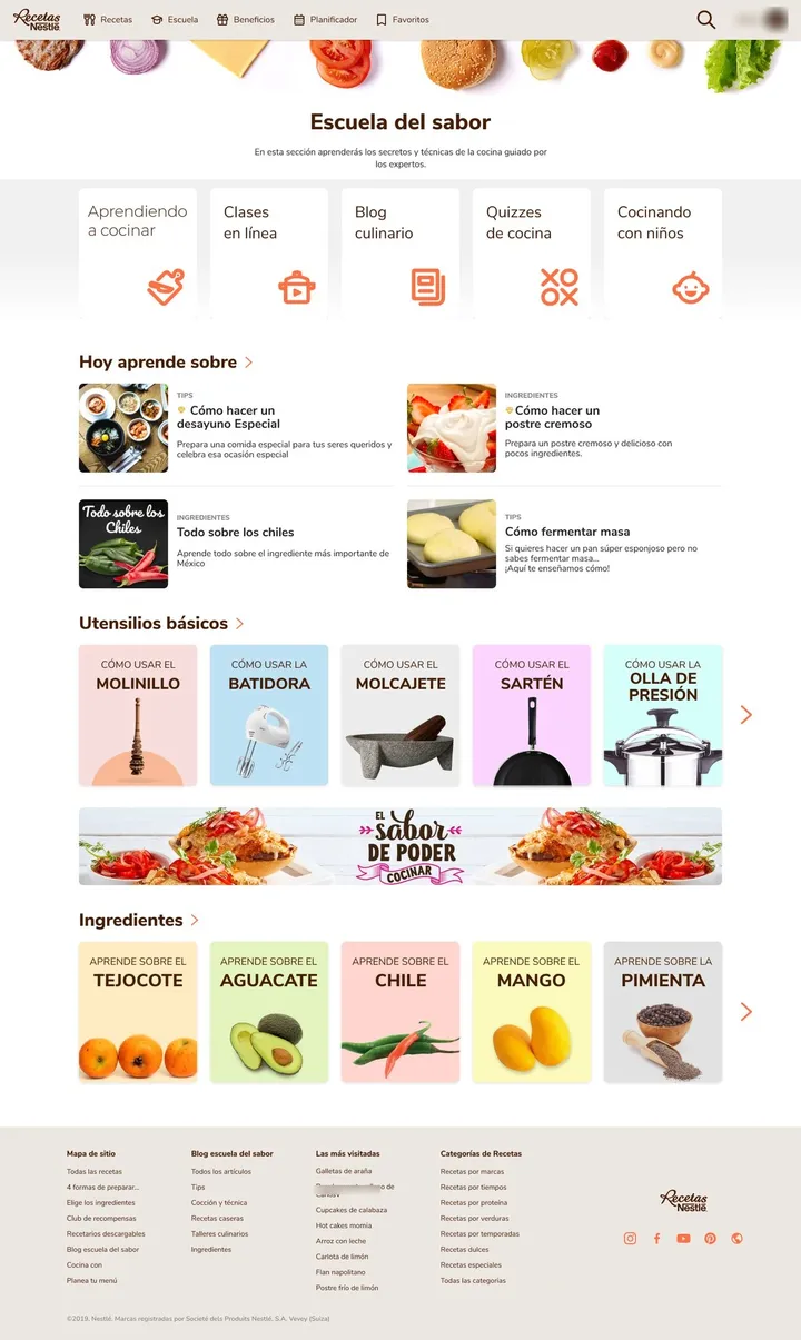
- Also: recipe books and lists, planner, Escuela del Sabor, brand corners, community and benefits.
Registration works as an exchange: the guest home lists what you get by signing up, and the signed-in home replaces that block with shortcuts.
Open full image (opens in a new tab)
Open full image (opens in a new tab)
Delivery and status
Delivery took six months after the pitch. F5 built the platform and asked for changes during development, which we applied. Everything we designed was implemented, except the cart.
Impact
The platform runs today on Nestlé’s recipe sites in Mexico, Brazil, Central America, the Caribbean and South America. The sites have evolved since, but the category structure and the brand entry points are still there.
Reflection
One base can carry many markets, if the markets choose what bends. I stopped asking “how different should each market be?” and started asking “which differences are worth maintaining?”
Presenting in English changed how I work. I presented to Brazil and the global team in English, and learned to explain decisions, not just show screens.